Building a machine-learning pipeline with scikit-learn and Qt - Part III
The assessment and visualization of the distribution of the features is an useful task to better get a sense of the discriminative capability of the features and how they relate with each other. In part II we talked about the dataset and the data collecting process. In this post we take a look at some common tasks such as:
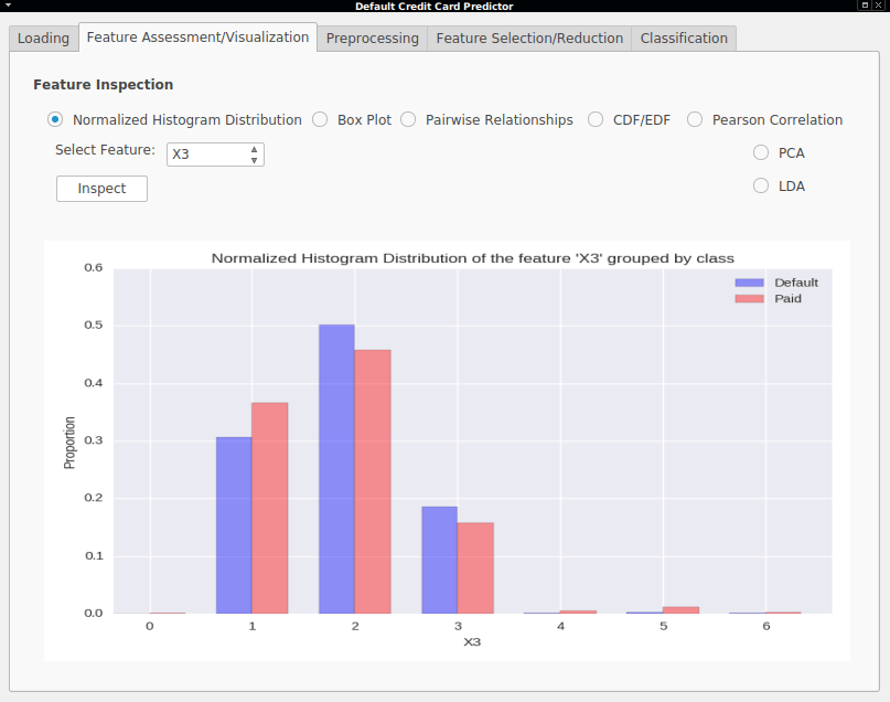
- Normalized Histogram Distribution - A normalized histogram (bin counts divided by total sum) showing the proportion of each feature value is shown for a certain feature where bars are grouped by class.
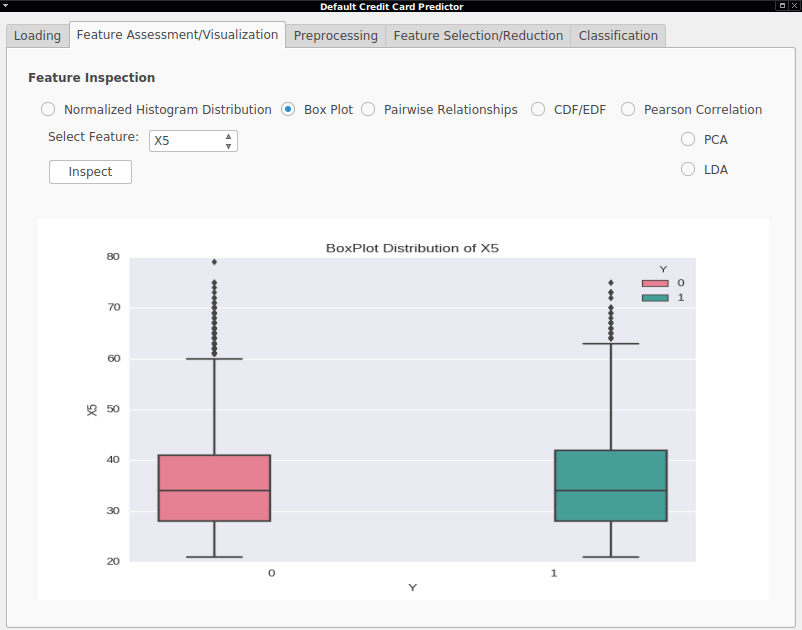
- Box Plot - A box plot for visualizing the distribution of the feature values of each feature grouped by class.
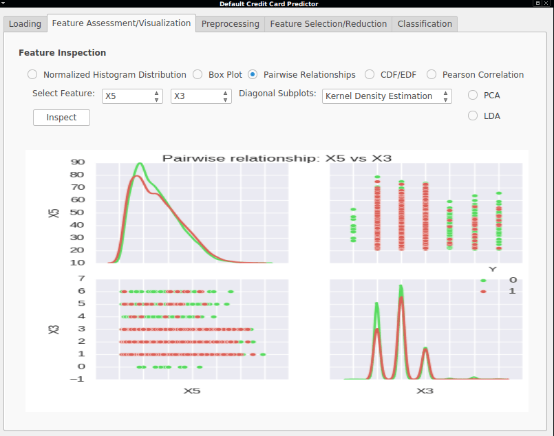
- Pairwise Relationships - A graph plotting the distribution relationships between two features, resulting in a 2 × 2 matrix where each diagonal element showed either the histogram distribution or the kernel density estimation of each feature distribution. Non-diagonal elements included a scatter plot of the two features grouped by class.
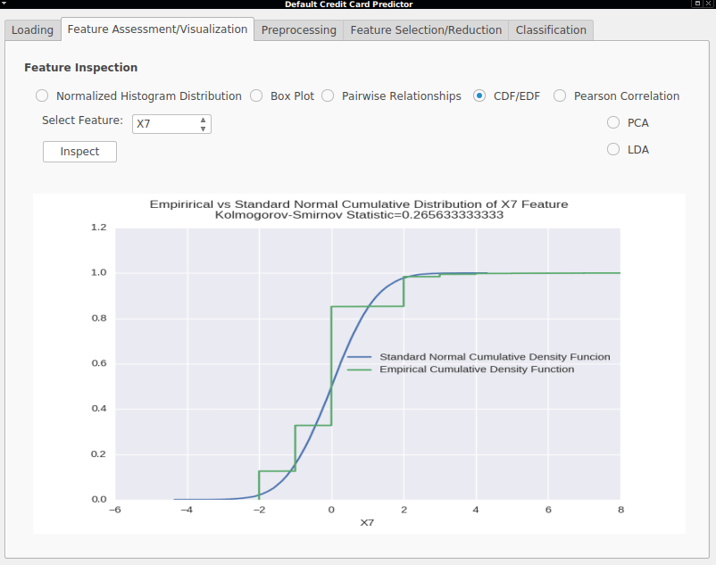
- Empirical Cumulative vs Standard Normal Density Functions - The Empirical Cumulative Density Functions are also shown against the standard Normal curve, along with the Kolmogorov–Smirnov statistic useful to test if the two functions are drawn from the same distribution (Standard Normal, in this case).
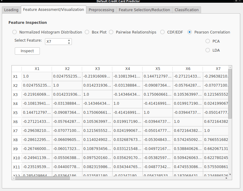
- Pearson Correlations - In order to see how strongly related two features are, the Pearson Correlation matrix is also shown, giving values between -1 and 1, where absolute values closer to 1 mean a high correlation. The sign indicates whether there is a positive relationship between the variables, that is, if a feature value increase or decreases, the other increases/decreases as well (positive correlation) or if one variable increases/decreases, the other decreases/increases with it (negative correlation).
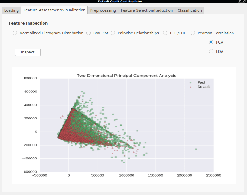
- Two-Dimensional Principal Components Analysis - A visualization of the two main principal components (directions with the highest variance).
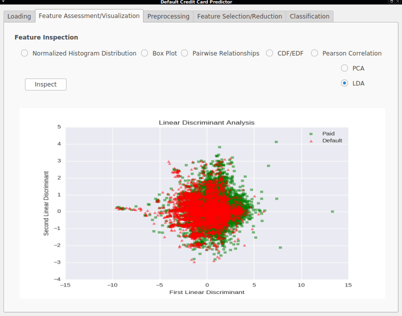
- Two-Dimensional Linear Discriminant Analysis - A visualization of the two first linear discriminant directions (directions with highest class-separability and lowest inner-class variance).
The next post will be about preprocessing methods that we can apply to our data. Stay tuned.